Goldilocks and the three data sets
I used to work within a structural biology lab, specifically X-ray crystallography (XRC). Currently within structural biology, an upcoming technique called Cryo-electron microscopy (Cryo-EM) is garnering an exceptional amount of funding and talent. This is not unreasonable, it’s a very cool technique generating structures of huge multi-component complexes that are having drastic implications on our current understanding of biology.
However, it’s not the king yet. As someone who still was trying to innovate XRC, I felt I had to justify its continued use every time I presented my research findings. I felt like sometimes I was putting out an instructional video out on VCR instead of Blu-Ray.
I did however find a way to demonstrate that XRC is still an incredibly powerful technique, but it required crunching some data. The data came from the protein data bank, the PDB, which is a repository for the determined structures of life science molecules too small to see, typically proteins and DNA or RNA fragments.
So here’s what I wanted to show:
That XRC is responsible for almost 10x the number of structures of all other techniques combined, and
That the reason for this is that XRC is best suited for determining structures that match the median size of individual proteins.
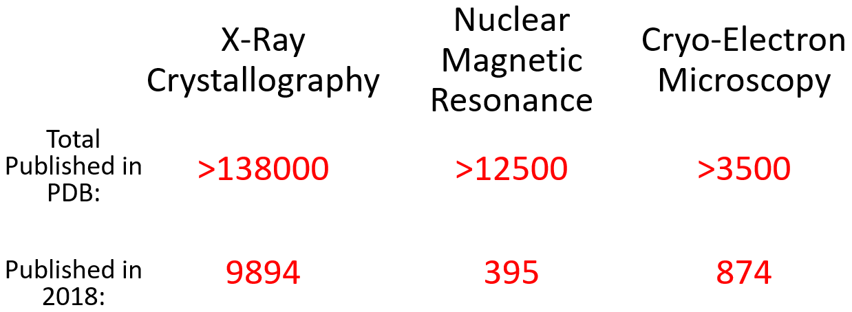
The first point is easy, break down the number of structures solved by each technique, which the PDB has already done.
Quick aside, the third technique commonly used in structural biology is nuclear magnetic resonance spectroscopy (NMR), which is particularly good at small things.
Anyway, here’s what point 1 looked like in Sept 2019:
Okay, but what about point 2? That’s a tougher nut to crack. I first decided that I only really cared about proteins, so I would only deal with that data. Throughout the following explanation, feel free to scroll down to the resultant figure.
Point 2 involves determining the size of each protein solved by each technique and comparing that to the average size of proteins found in a representative array of organisms. The size of each protein solved at the PDB can be found but must be filtered by the technique used to generate the structure. When you’re dealing with 150 000 entries, this becomes a technical challenge but is not insurmountable with the combined might of caffeine and Excel. Provided you know how to sort data, a functional understanding excel functions and macros, this was relatively easy. I eliminated all structures solved by tandem approaches, and then plotted them by weight; as proteins are irregular, 3D shapes, doing them by volume or a certain dimension isn’t very useful.
When plotting, I wanted to demonstrate that XRC is the Goldilocks of structural biology techniques. To paraphrase the story, NMR solves proteins that are (too) small, and CryoEM solves proteins that are (too) big, but XRC solves proteins that are just right! To that end, I wanted a visual representation that gave a clear average for each technique. I decided on a geometric-based binning of molecular weight, i.e. I made “bins”, the first being 2 to 3 kDa (N.B. kDa = kilodalton, a unit of mass for very small things) and then the next bin was 1.5x bigger. So bin 1 has a range of 1 kDa (3-2=1), the second bin would have a range of masses that is 1.5x that, ranging from 3 to 4.5 kDa. This was multiplied out, and each structure was put into each bin, e.g. if a protein structure was 12 kDa it would go in the “10.1-15.2 kDa” bin.
The next issue is that there are vastly different amounts of proteins solved by each technique, which necessitates the use of a percentage-based system of visualization. So the frequency of proteins found in each bin was converted into a percentage of total proteins solved by that technique. E.g. approximately 21% of proteins solved by XRC are within the range of 34.2 and 51.3 kDa, therefore there’s a point at 21% at 51.3 kDa (the upper limit of the bin).
Okay so that’s half, the other half is demonstrating biological relevance. To demonstrate this, I got the proteome of a range of model organisms. The proteome is simply all the known proteins that are made by an organism, and are publicly available. Model organisms are those that are commonly used in research; for example, D. melanogaster is a fruit-fly and has been a staple in genetics and developmental biology for years. Similarly, S. cerevisiae is baker’s yeast and is the simplest eukaryotic organism.
So once I got the proteome, I could convert each protein to its molecular weight and used the same binning system to generate a frequency of size for each organism. It was doubly-beneficial to use a percentage-based system above as each organism had a different number of proteins and so each data-set integrated smoothly into the plotting process.
Finally, the Goldilocks graph was done. Note: in actuality, there’s a huge figure legend explaining the above but here’s the presentation slide:

So remember kids, when people stop you in the street to preach the good name of CryoEM, you remember that XRC is the real Goldilocks.